Challenge:
INK was preparing to open a new Chinese-American restaurant and tasked us with developing and supporting the brand identity. The challenge was to create an elevated yet approachable brand that captured the spirit of late-night Chinese-American dining. They were looking for something fun, soulful, and full of energy, without leaning into overly high-end or overly traditional territory. The goal was to showcase authenticity, quality, and craft, while connecting diners to the cultural roots of the cuisine. The brand also needed to build social proof, foster a sense of belonging, and drive urgency to visit and share the experience.

Strategy:
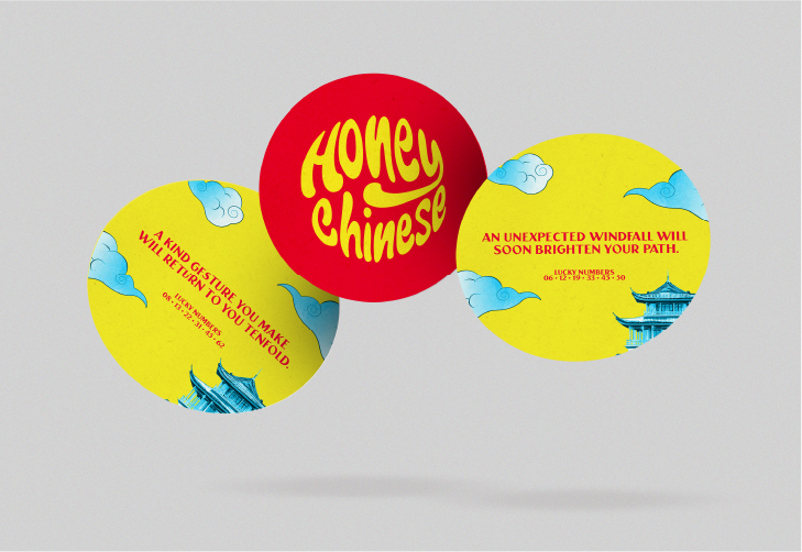
We designed a full creative guideline including logos, chopsticks, and takeout boxes to match our bold, playful social strategy. The design approach emphasized approachability and fun, bringing back what people love about Chinese-American dining with a fun, urban twist.
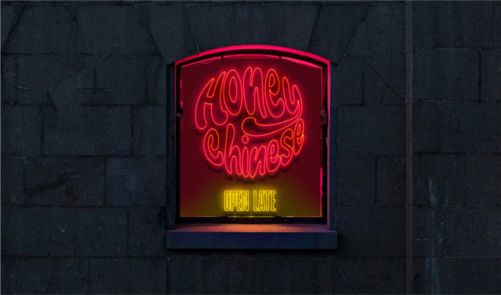
The brand identity leaned into bright, bold accents and a colour palette of red and yellow with hints of blue. It’s traditional meets modern, delivered in a cool and artful way. The logo, designed as a neon sign, underscored the open-late value positioning of the restaurant. Our guiding brand personality was warm, playful, spunky, soulful, and homey, deliberately avoiding tones that felt corporate, gimmicky, pretentious or sterile. The result was a distinctive, late-night-ready brand identity that stood out from the competition while staying true to the cultural and culinary roots.


