Challenge:
INK challenged us to create an approachable Italian-American brand that could speak to both celebrations and weekly dining traditions. The goal was to design a brand that felt warm, inviting, and authentic; nice enough for a night out, yet casual enough to become a go-to neighbourhood spot. It was important to strike a balance between celebratory dining and family-friendly frequency, creating a restaurant people could call their own.
Challenge:
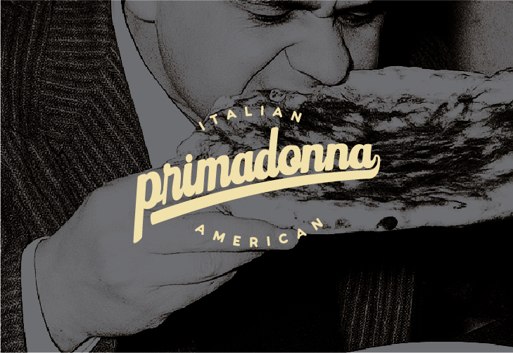
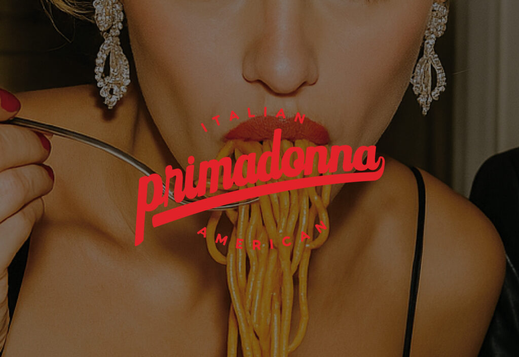
We developed Primadonna as a brand rooted in nostalgia, abundance, and togetherness. Drawing inspiration from the Italian-American tradition of family-style dining, we built an identity that radiates comfort and charm with a subtle, sultry edge. Primadonna’s positioning was centered around the joy of gathering with oversized plates, rich flavors, and a welcoming atmosphere that makes every guest feel like famiglia. By combining authenticity with a touch of theatricality, we created a brand that works for weekly dinners, spontaneous nights out, and celebratory occasions.
The visual language leaned into classic Italian cues like red-and-white gingham patterns, bold typography, and warm, saturated tones. We paired the colour scheme with playful photography and dramatic flourishes that add personality and flair. This balance ensured the brand felt both familiar and fresh, approachable yet distinctive.