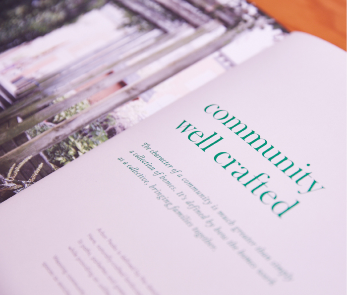
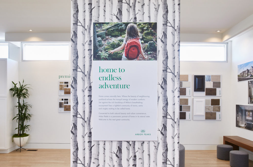
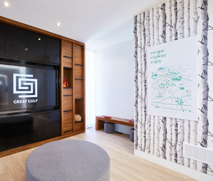
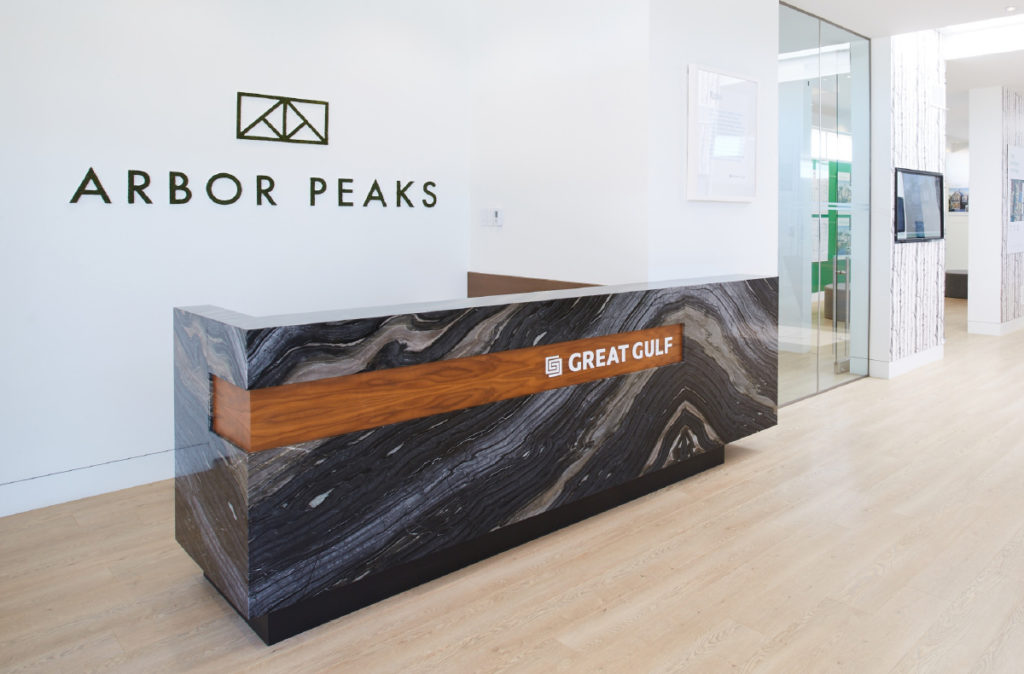
Rustic yet refined, the intricately designed brand identity and all touchpoints visually reinforce the natural beauty of the Milton community, with a medley of symbols coming together to creatively represent not only the area, but the emotive connection between the outdoors and within.
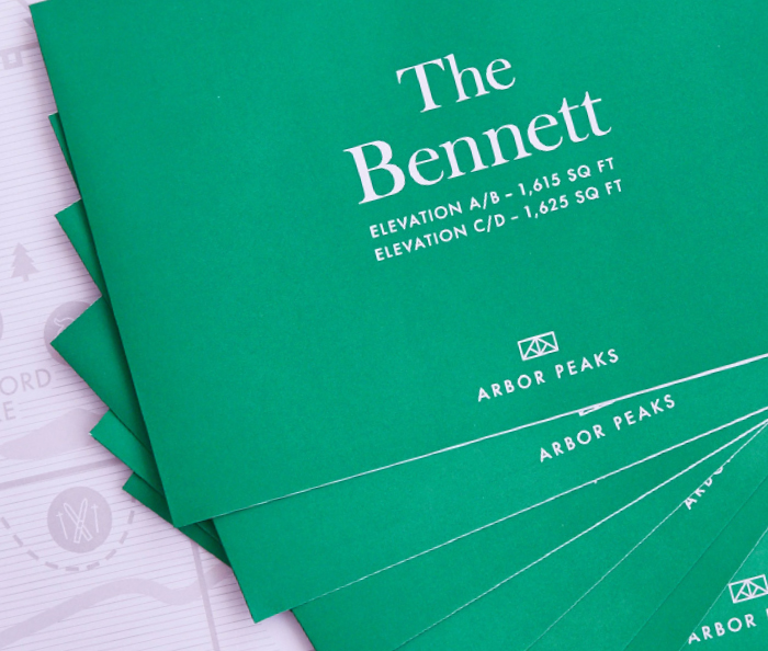
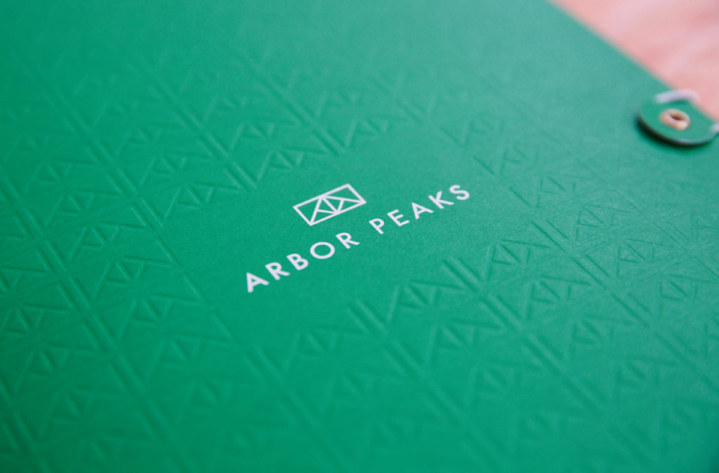
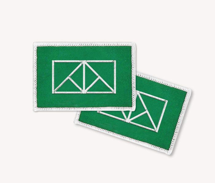
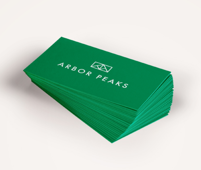
Celebrating the great outdoors and escarpment living, along with the beauty of the homes within the community, a symbol was developed for each defining characteristic; trees, homes, and of course the escarpment. When placed together, they created an emblem for Arbor Peaks; a marker of the lifestyle offered at Milton’s next great community.
The modern design that was was clean and impactful, reflecting the friendly and approachable nature of the brand and community. Qualities also reflected Arbor Peaks’ intended target market; a coveted cross-section of millennials, first time homebuyers and families looking to ‘move up’.