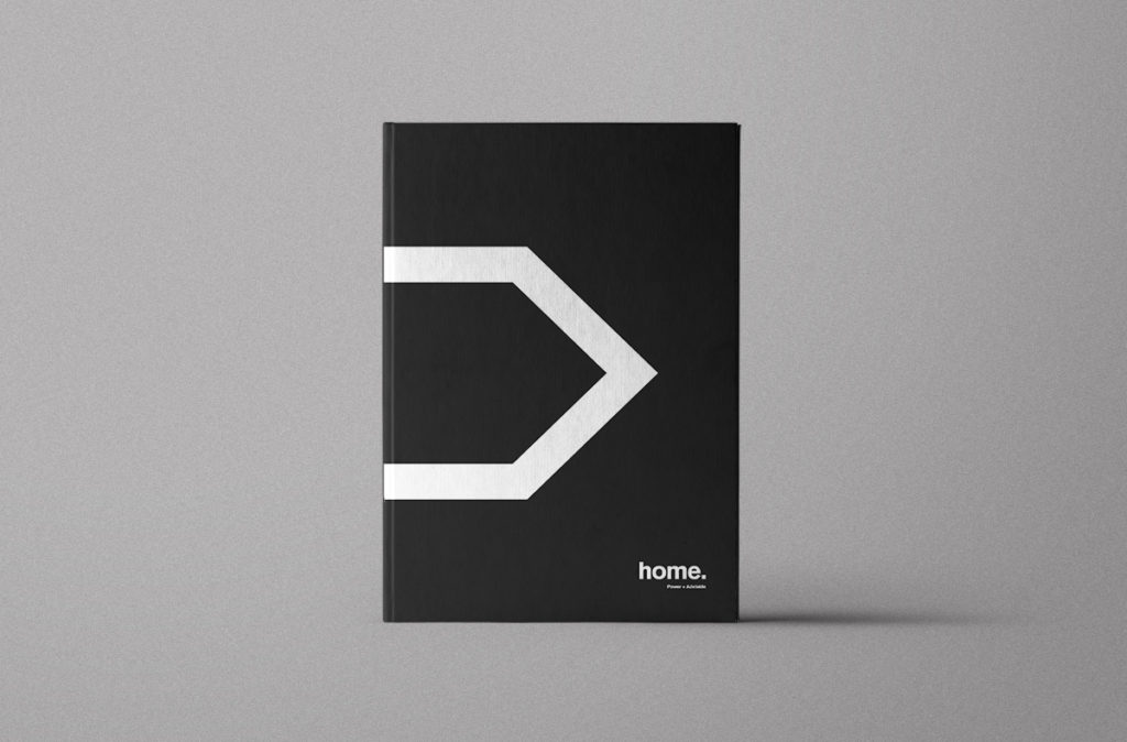
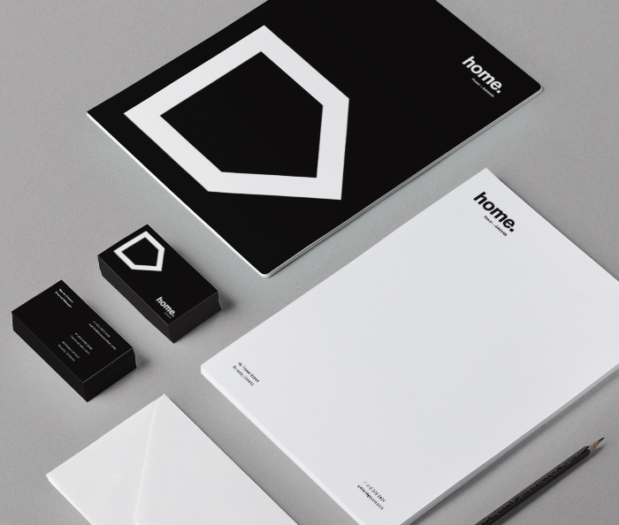
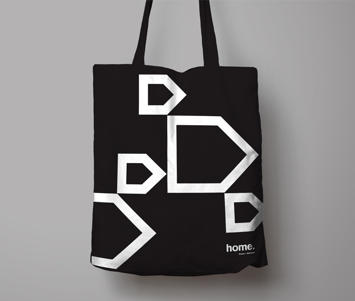
In Toronto, east is the new west. Millennials, artists and urban pioneers are moving to the city’s east end and defining the new cool neighbourhoods. The home icon is designed to act as a beacon for this urban movement. Designed with simplicity and modernism in mind, the home logo is a simple house icon, turned to face east.
We stripped everything from the logo, except what was truly essential. We used the most recognizable font in the world, Helvetica, and we kept everything black and white to convey a timeless authenticity. Every component of the logo is classic cool, and irreproachable from a design perspective. We were inundated with inquiries from the city’s trendy 20-somethings and design crowds.